Baltimore City Crime Data Dashboard
Project to construct a data dashboard to track and visualize crime statistics for Baltimore City.
NOTE: This project was done over a duration of 12 weeks to fulfill the Course Project requirement for CMSC 636 - Data Visualization at University of Maryland, Baltimore County. The following is a paraphrased version of the 8 page project report that was written in conjunction with four peers: Rohit Mokashi, Jason Seaman, Paul Ledala, Dingyi Pei.
Time Period: September, 2021 – December, 2021
Contents
Introduction
From the award-winning crime drama “The Wire”, to the site of the 2015 Freddie Gray riots, Baltimore has a contentious relationship with race and policing. The increasing number of crime incidents is an issue for both police departments and law enforcement. Increased crime is a product of inefficient policing, which in turn leads to more crime and therefore even worse policing. Therefore, data analysis becomes not just an essential task, but an urgent need of the hour, requiring analysts to carry out a comprehensive study of crime incidents to identify factors that contribute to the committing of a crime. Visualization techniques have been shown to be useful in various domains but have not been widely studied for applications in crime analysis where it is useful to identify the relationships among different entities such as people, vehicles, addresses and organizations. It is critical for crime analysts to retrieve, understand and analyze these relationships efficiently and effectively.
Dataset Information
In January 2021, current Baltimore mayor Brandon Scott re-launched the Open-Baltimore data project with policing transparency in mind, which provides us with Service calls, Crime, Arrest, and incident data for the city of Baltimore. The crime dataset is upated daily, with the earliest record ranging back to October 30th, 1963.
Goals
- Create a data dashboard with different visualizations based on crime statistics of Baltimore City present online at the Open-Baltimore project.
- Build visual representations capable of handling large datasets and enable police to explore, compare, and analyze evolutionary trends and patterns of crime incidents.
Approach
The major deliverable of this project is a platform developed and structured on the webpage based on the backend server, allowing users to select parameters they are interested in to observe particular visualizations. The frontend of the product is a Vue application that gives the user an exploratory data experience with the Baltimore Police Department’s crime and arrest data. The user is immediately greeted with a large map of Baltimore’s municipal boundaries and a recent selection of crime data posted around the city.
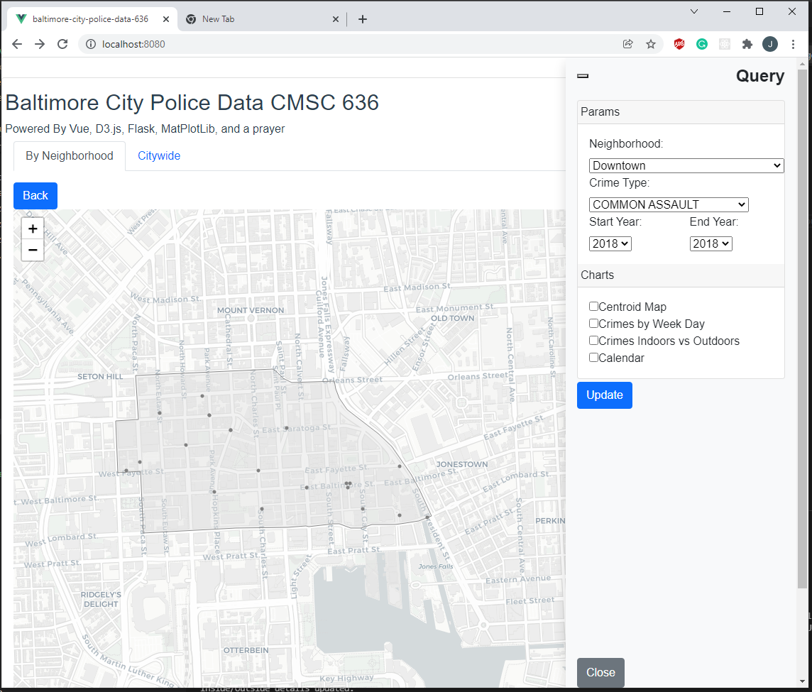
D3 Visualizations
Considering the geographic nature of the crime incidents, an interactive map of Baltimore City was used for geospatial visualization. D3 was used as the primary approach here to show the incidents were mapped according to their geolocation. For more information, based on the geographical visualization, the specific incident categories at each area were added to provide a clear and general overview.
D3 Examples
In the following visualization, the locations of different types of crimes over a specified time range is displayed against a map of Baltimore City. The website contains a legend that informs the user about the significance of each color, and generates the visualization after the time range is specified.
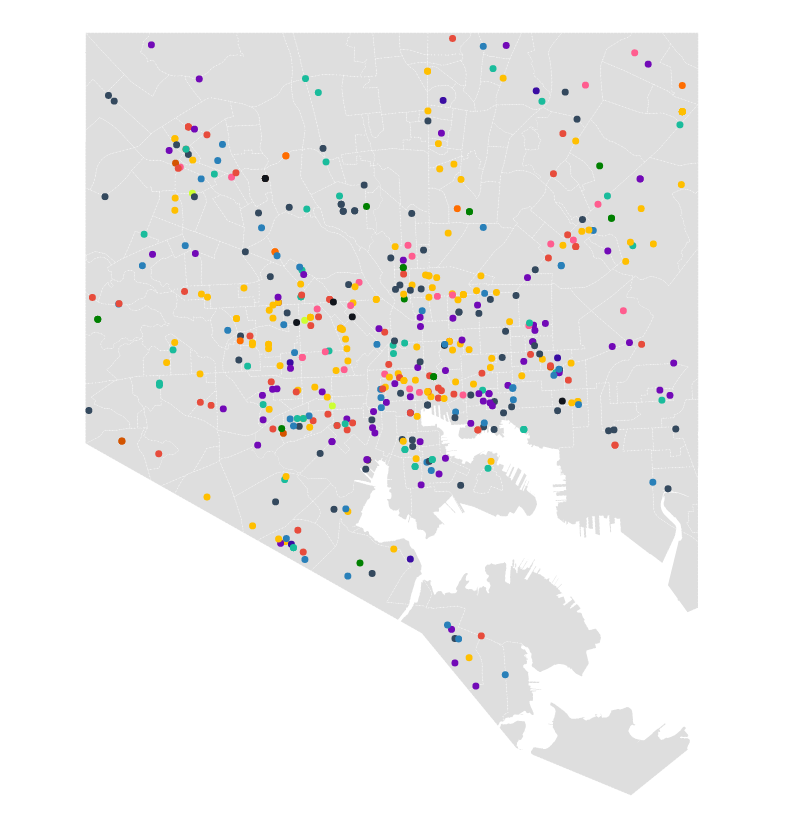
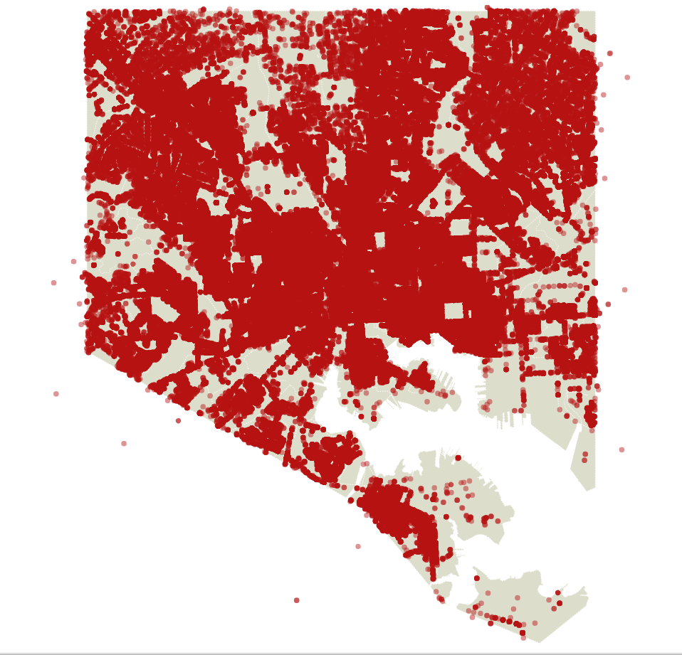
The following map is generated using D3.js, Baltimore City crime data geojson, and the topojson of Baltimore City neighborhoods. The map uses Albers projection. This visualization displays points of the crime on the Baltimore City map.
Python Visualizations
Several visualizations are created in Python using Matplotlib and seaborn libraries, which are very versatile libraries that help in plotting a wide range of visualizations. In this part, we focused more on the temporal domain of the crime data and provided the trajectory of incidents over years, months, days of the week and hours of the day. Multiple visualizations are developed allowing the users to select the parameters to observe the crime.
Python Examples
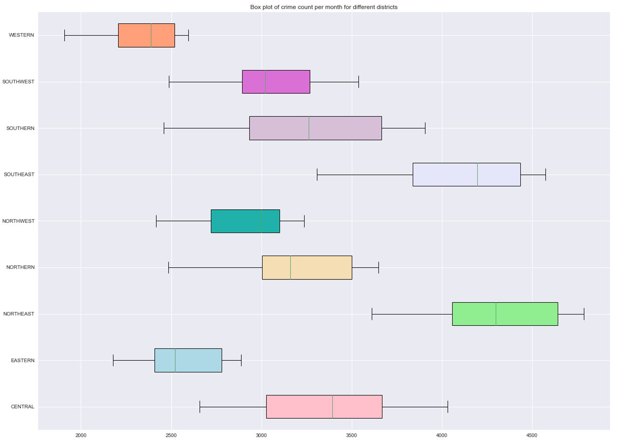
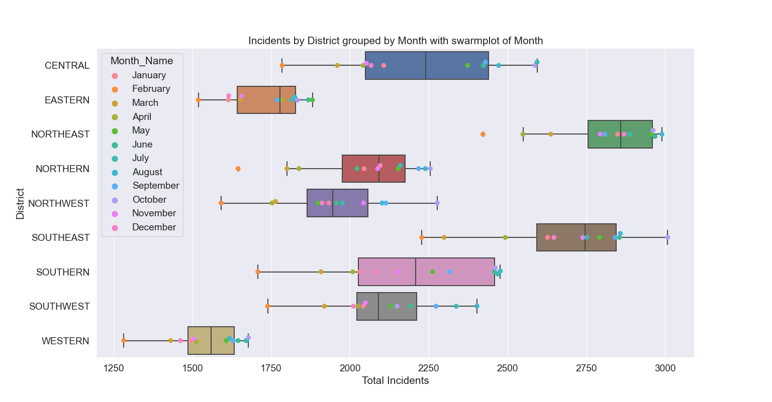
In the following plot, it can be inferred that the Northeast and Southeast districts are the two most crime-infested districts. The Western district is by far the safest, with the Eastern district being a close second.
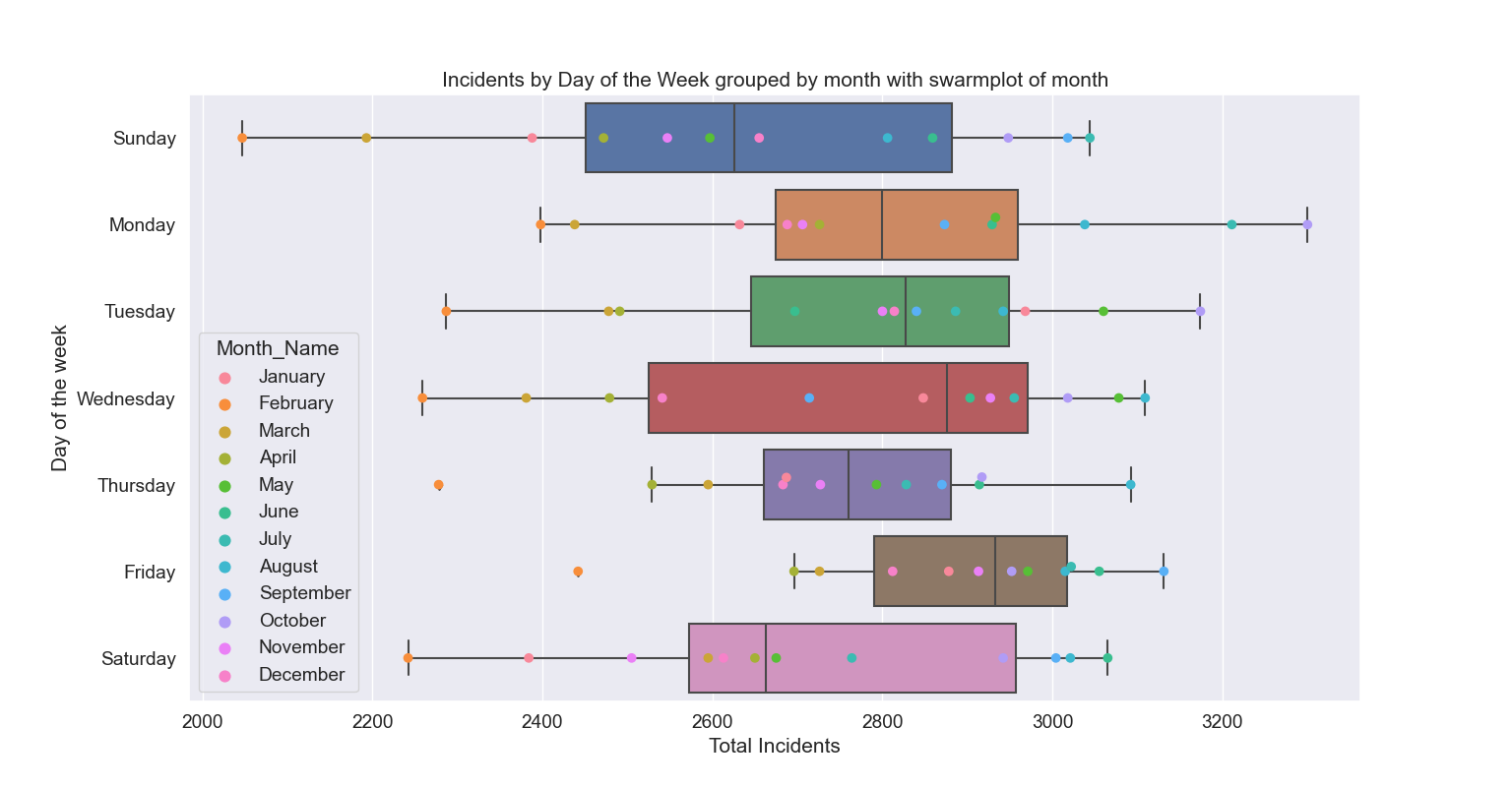
In the following visualizations, a swarmplot is plotted against its corresponding boxplot in order to show the user the distribution of data points. These data points are labeled as well, thereby adding another layer of information to the visualization. By contrasting a coloured swarmplot against its boxplot, it helps the user determine distribution of crime against different categories, such as days of the week and districts, as shown.
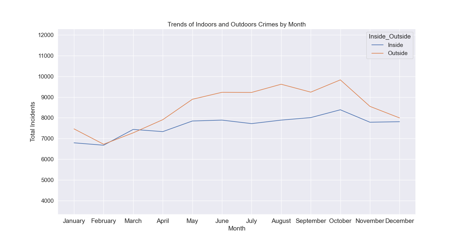
Simple line graphs were used to show the trend of indoor and outdoor crimes across different months of the year in the time range specified by the user. This is instrumental in understanding the general trends and helps the police determine where to spend resources at different times of the year. For example, the significantly higher number of outdoor crimes during July - October period followed by a significant dip in the next three months implies that weather is a significant factor in the number of outdoor crimes committed. This can be used as a launching point to determine the counties or sections of the cities with higher crime during these time periods and ensure better policing in the area to help make the community safer.
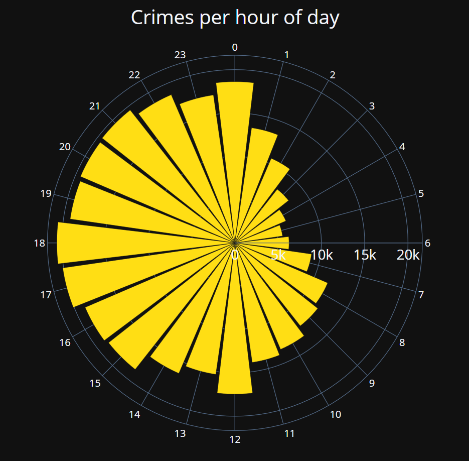
The above nightingale rose chart visualization shows the crime count per hour. It is observed that crime from 1AM to 11AM is almost half of the crime occurring in the rest of the day (noon, evening upto midnight). This seems intuitive as most of the crimes occur outside of sleeping hours. However, it would be interesting to observe the burglaries, theft, and larceny separately in the same chart, by filtering using crime types in order to determine the time of day when they are the most frequent. This information can be used in effective patrolling and policing at specific times of the day where stores vulnerable to such crimes are present.
Future Improvements
Due to time constraints, there was no chance to perform optimal data handling. Given the scope of the project, sufficient data preprocessing was done but there definitely is more potential for improvement. Sometimes, requesting a chart took up to 20 seconds, which calls for further investigation into data processing for quicker chart generation.
The version delivered for the project was running on a single data dump. If this project was to be made for an actual client, the ideal scenario would be to write an ETL code that would perform incremental data dumps, with the ETL framework consisting of a control table that tracks the last performed dump and only fetch the necessary rows from the source into the application.